- How have corporate ownership rates changed over time? I’m curious about this question because of one of the readings from our first assignment (“When Private Equity Becomes Your Landlord”), which provided examples and data about how private equity-backed firms have been buying more rentals in the past decade.
Are there geographic patterns to corporate ownership rates? I’m curious about this question based on the housing trends I’ve seen in other cities (for instance, higher demand for units closer to downtown or features such as lakes). For the Boston dataset, I’m curious about how similar nearby neighborhoods will be in terms of corporate ownership rates, and what patterns emerge around features such as the Charles or Harbor.
Is there a correlation between corporate ownership and factors such as total population size or family-dominated areas? When I grew up in a family-dominated area in Austin, TX, nobody I knew lived in a corporate-owned building, but that became very common when I moved to a denser and “younger” part of the city near the university. On the other hand, when I lived in Singapore, I did know families who lived in corporate-owned apartments, and this difference may have been due to factors such as population density. So I’m curious to see what patterns emerge from the Boston data.
Is there an effect on vacancy rates from corporate ownership? One of the suggested readings for the “Housing for the Rich” subtheme (“Reckoning with Boston’s Towers of Wealth”) discussed the rising construction of ultra-luxury housing, which has an effect on not only housing prices, but also vacancy rates (since many properties go unused).
Discoveries & Insights
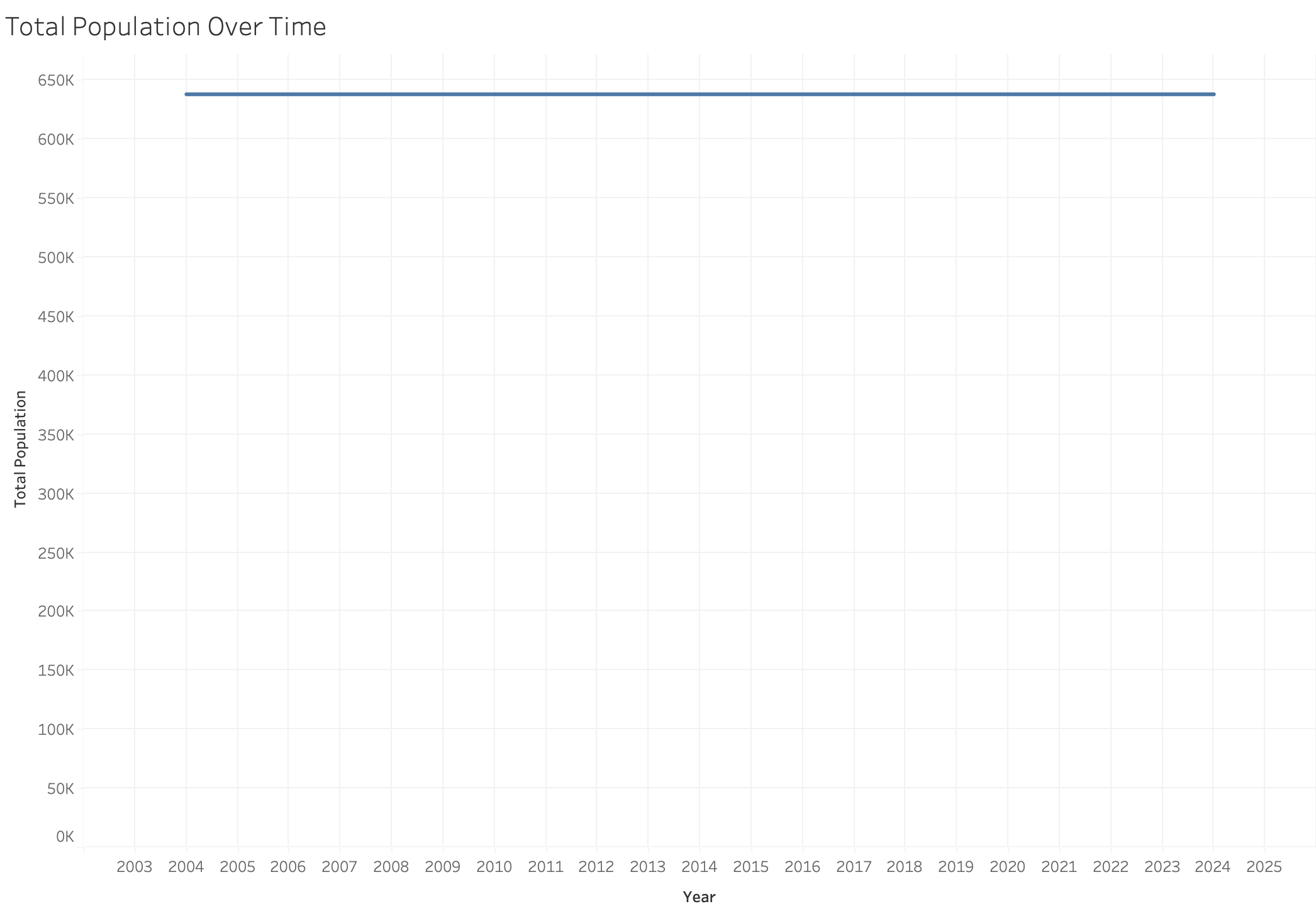
To begin our quality assessment of the census data, we first examine the total Boston population over time. However, we find that the values for each year remain constant, and closer inspection of the dataset reveals that the census data are constant across all years for every neighborhood! Looking at the source of the census data, we find that the data comes from the year 2020. As a result, for any following visualizations that require census data, we will filter to fields for the year 2020.
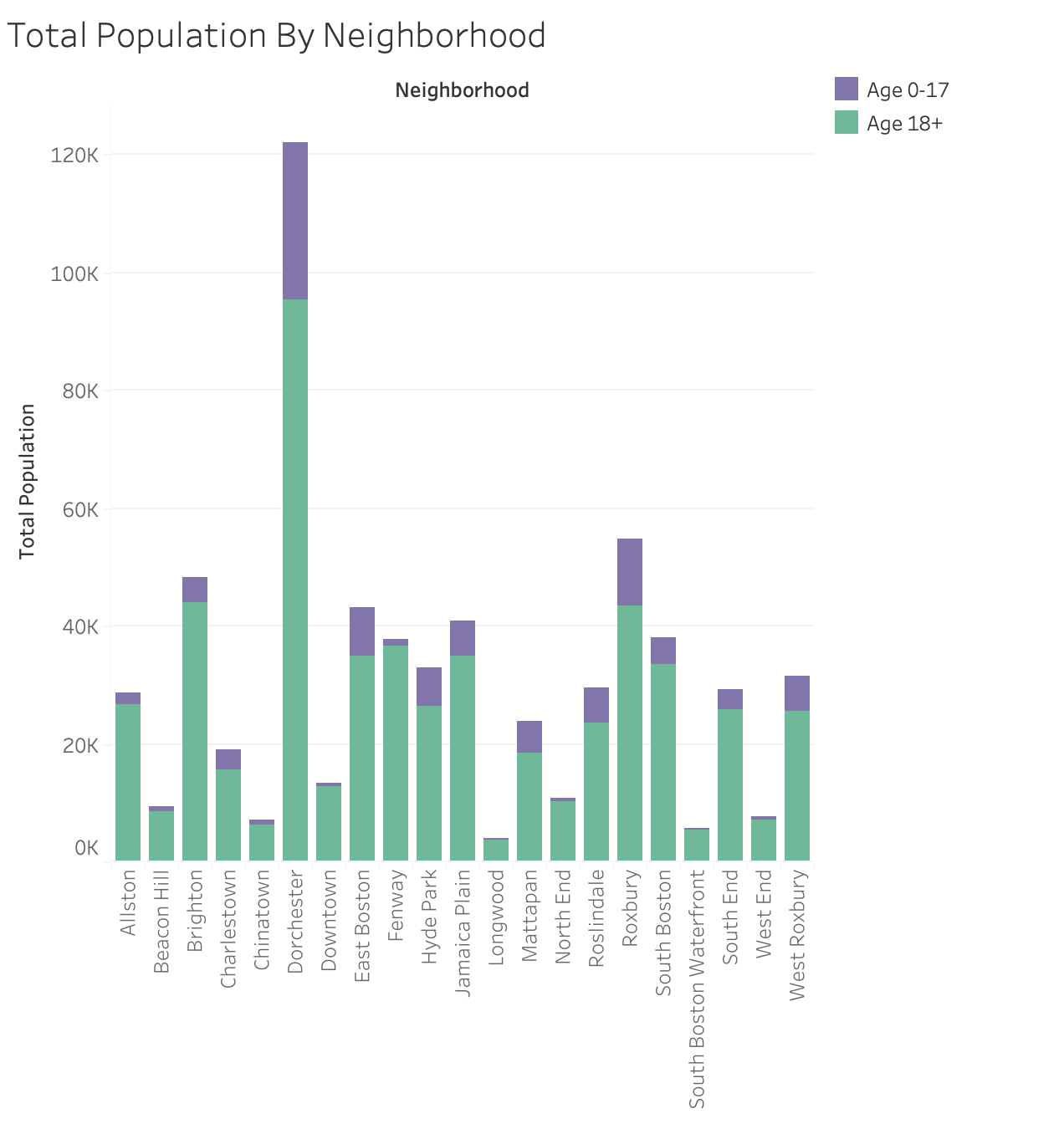
To take a closer look at the quality of the census data, we first view the distribution of total population size across all neighborhoods, showing a breakdown by age since one of our questions looks at family-oriented areas. This figure lets us verify that all neighborhoods have reasonable values, and it also gives us an initial idea of what some of the demographic data looks like, which will be useful to keep in mind as we move forward with our analyses. In particular, Dorchester stands out as having over double the population of the next most populous neighborhood, with more children than the total number of people in many neighborhoods.
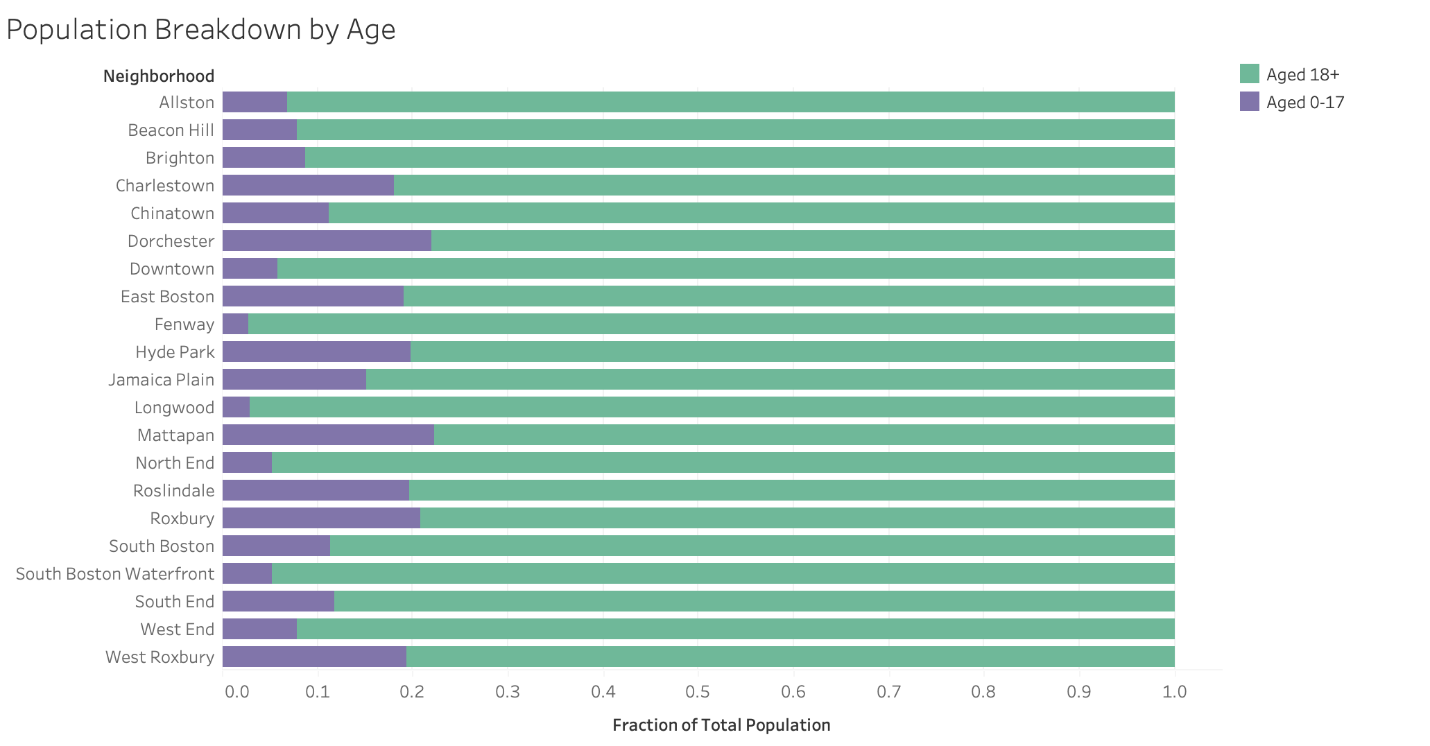
We generate a stacked bar chart by dividing the aged 0-17 and aged 18+ populations by the total population. Firstly, this verifies that the age-related census data are consistent with each other (i.e., that the sum of children and adults add up to the total population). Secondly, this visualization provides an easier way of comparing the overall age demographics of each neighborhood to each other by normalizing the populations. In particular, we notice the high proportion of children (and by proxy, families) living in areas such as Dorchester, Mattapan, Roxbury, and Roslindale. On the other hand, neighborhoods such as Longwood, Fenway, and North End have a relatively small proportion of families.
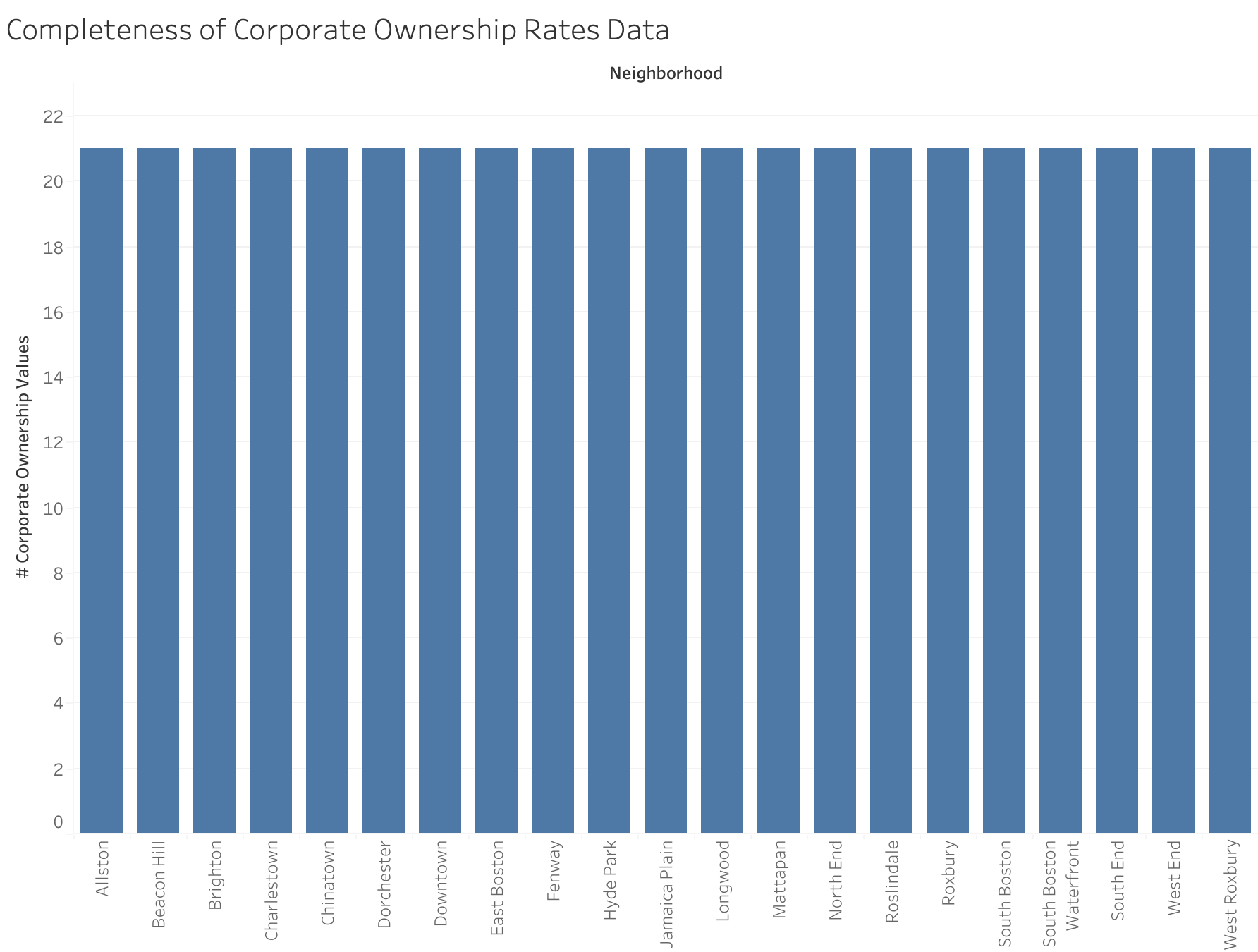
To perform another high level check, we confirm that every neighborhood has 21 values for corporate ownership rates. However, in doing this initial view of the dataset, we find that some of the Boston neighborhoods are missing (e.g., Back Bay and Mission Hill). Therefore, those zipcodes are excluded in future map visualizations. When checking the zipcodes file, however, we run into another issue and find a few cases of zipcodes that are incorrect, perhaps due to some overlap between neighborhoods (e.g., the West End was missing because its zipcode was only labeled as Beacon Hill), so these were corrected when possible to make the map visualizations better representative of the neighborhoods.
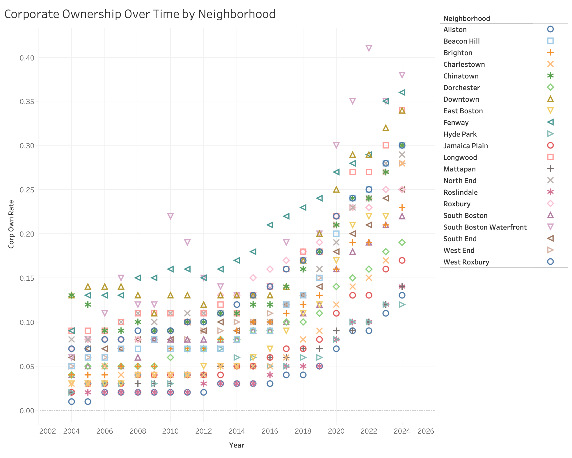
We continue our quality assessment and begin analysis with this scatter plot, which shows an initial overview of the corporate ownership rate over time per neighborhood. We first use this to confirm that the ownership rates for each year and neighborhood look reasonable and are non-negative. Secondly, this plot shows a couple of interesting overall trends—for instance, we notice that there is a general increase in corporate ownership over all neighborhoods beginning in around 2015. In fact, by 2024, the neighborhood with the lowest corporate ownership rate is approaching the rate that was the highest in 2004. Additionally, the difference between the highest and lowest corporate ownerhip rates each year seem to grow with time. We also notice some neighborhoods standing out from the rest, such as the consistently high corporate ownership rates in Fenway, or the fluctuating ownership rates for the South Boston Waterfront. These patterns raise two additional questions for investigation: 1) Is the stability of corporate ownership rates different across neighborhoods? (i.e., did some neighborhoods have larger changes in corporate ownership rates compared to others?) 2) How stable are the relative rankings in corporate ownership rate between neighborhoods? (i.e., do popular neighborhoods remain popular?)
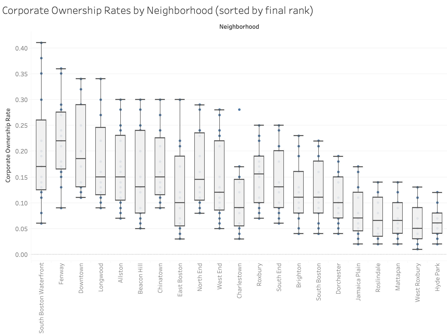
To look at how corporate ownership rates have changed across different neighborhoods, we generate this box and whiskers plot to look at the overall distribution of rates per neighborhood. The neighborhoods are sorted by their final relative rank (i.e., the neighborhood with the highest corporate ownership rate in 2024 is on the left), using past years as tiebreakers. One overall trend that we notice is that the higher-ranked neighborhoods tend to have larger deviations in the spread of their ownership rates. One possible explanation is that corporate ownership rates are increasing more rapidly in neighborhoods that have historically been popular with corporate owners due to perceived demand (this is supported by the previous figure, which shows the yearly range in corporate ownership rates becoming larger with time). We also notice an outlier year for for Charlestown, which will be investigated further in the next two visualizations.
We investigate the subquestion of neighborhood corporate ownership rate rank stability over time with box and whisker plots of each neighborhood’s yearly rankings. We use the same sorting as the previous figure, where the neighborhoods are sorted by their rank in 2024. We don’t see a clear pattern in variability between the top or bottom neighborhoods. The two most stable neighborhoods are Fenway and West Roxbury, which fall on opposite sides of the ranking (Fenway being consistently in the top 3, and West Roxbury consistently in the bottom 2). There are also examples of highly variable neighborhoods on both sides of the ranking (South Boston Waterfront and Hyde Park). However, the 2024 ranking seems to generally agree with the neighborhoods’ average rankings (suggesting there is overall not a lot of significant mobility), with some exceptions: Beacon Hill, East Boston, Charlestown, Roxbury, and Hyde Park. This raises another question: is there a pattern in the change in rank over time for these more “mobile” neighborhoods?
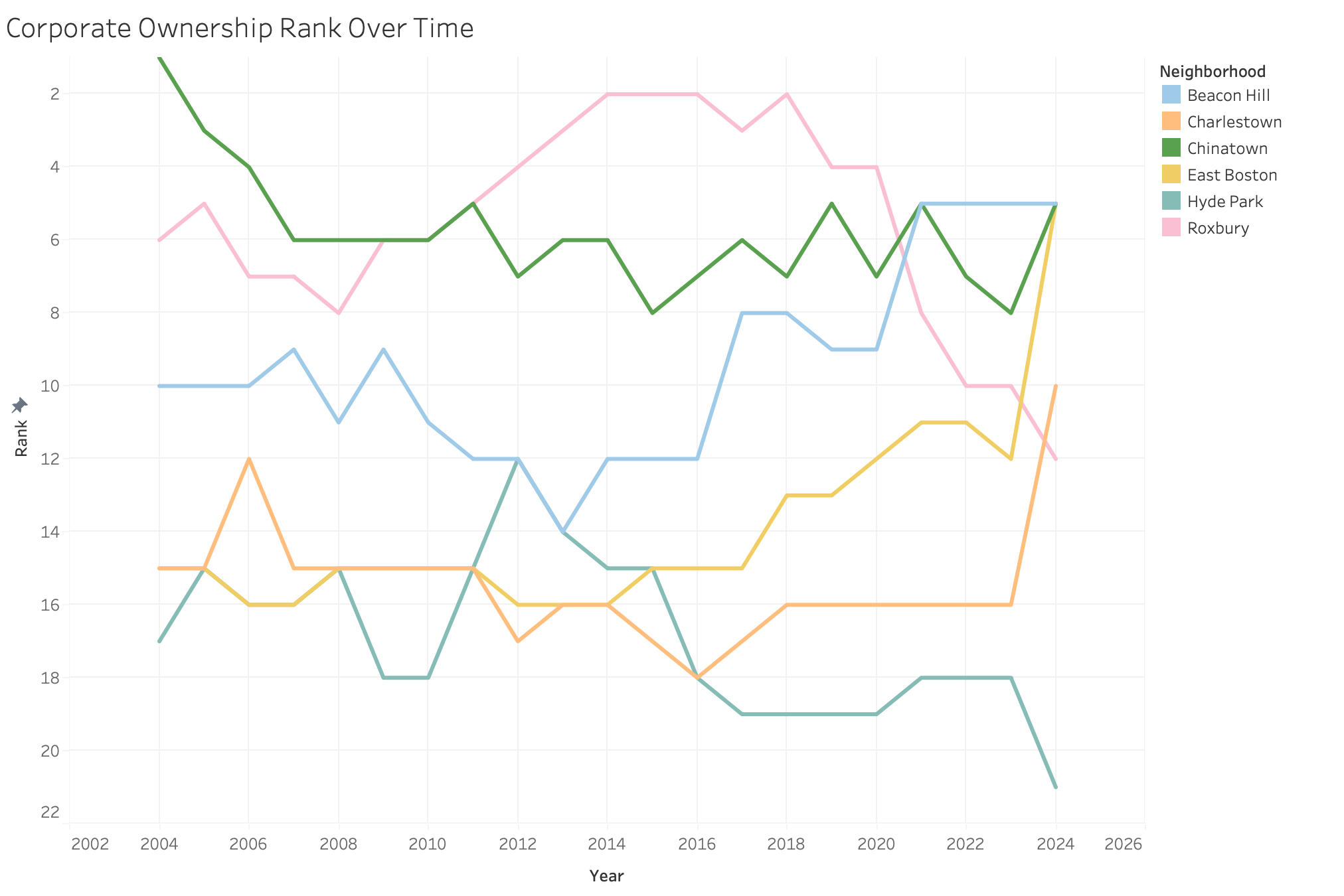
To continue investigating the neighborhoods that we flagged as interesting in the last figure, we plotted their relative rank in corporate ownership rate over time. We notice that Charlestown and East Boston have a very similar pattern, where they tended to hover in the middle of the neighborhood rankings but very recently experienced a higher increase in corporate ownership rate compared to other neighborhoods. We may see this similarity due to the neighborhoods being close to each other geographically. We also see Roxbury and Hyde Park experience an overall decrease in overall rank in recent years, around the time that Beacon Hill’s relative rank begins increasing.
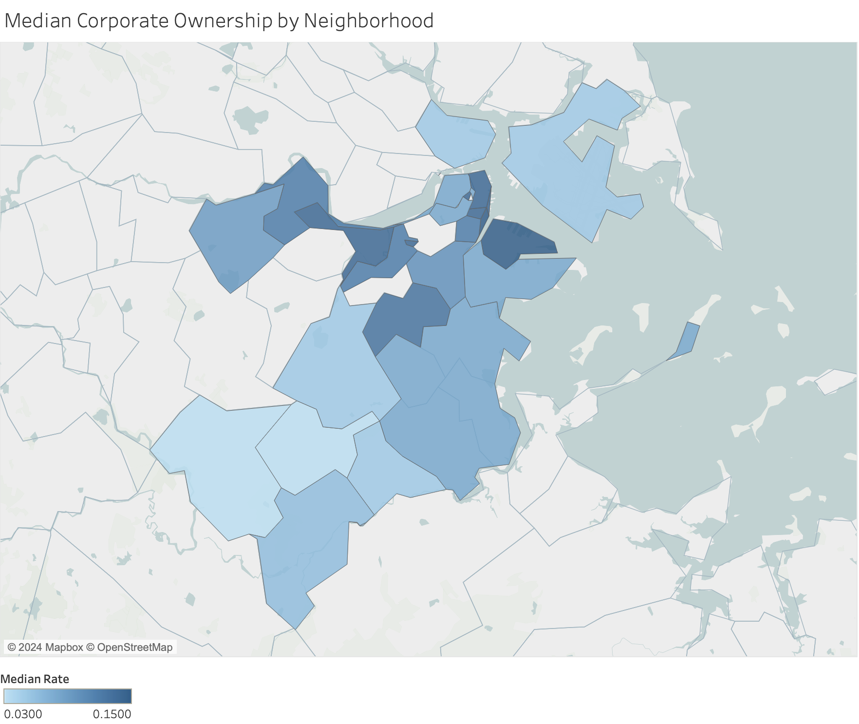
We then look at the question of how corporate ownership rate is distributed by geography. We use the median corporate ownership rate for each neighborhood, where a darker region corresponds to a higher median rate. We do see some patterns on the map—there is a cluster of neighborhoods with high corporate ownership rates lying along the Charles and the harbor, and the neighborhoods that are farther out and more inland tend to have lower median ownership rates. But considering these patterns in the context of our previous analyses, we raise another question: do we still see geographic patterns if we look at changes in relative popularity between neighborhoods over time?
To investigate the geographic patterns of neighborhood popularity over time, we colored neighborhoods by their change in corporate ownership rank between 2004 and 2024 (the regions shown in blue experienced a decrease in their popularity relative to other neighborhoods, while the red regions became relatively more popular when compared to other neighborhoods). We find that a lot of the neighborhoods experiencing a relative surge in popularity fall on the north part of Boston along the waterline. The neighborhoods in that area that decreased in relative popularity still seemed to decrease less compared to some neighborhoods farther south. West Roxbury was an exception to the general trend, but we note that it is generally stable and only moved from last place in 2004 to second-to-last place in 2024.
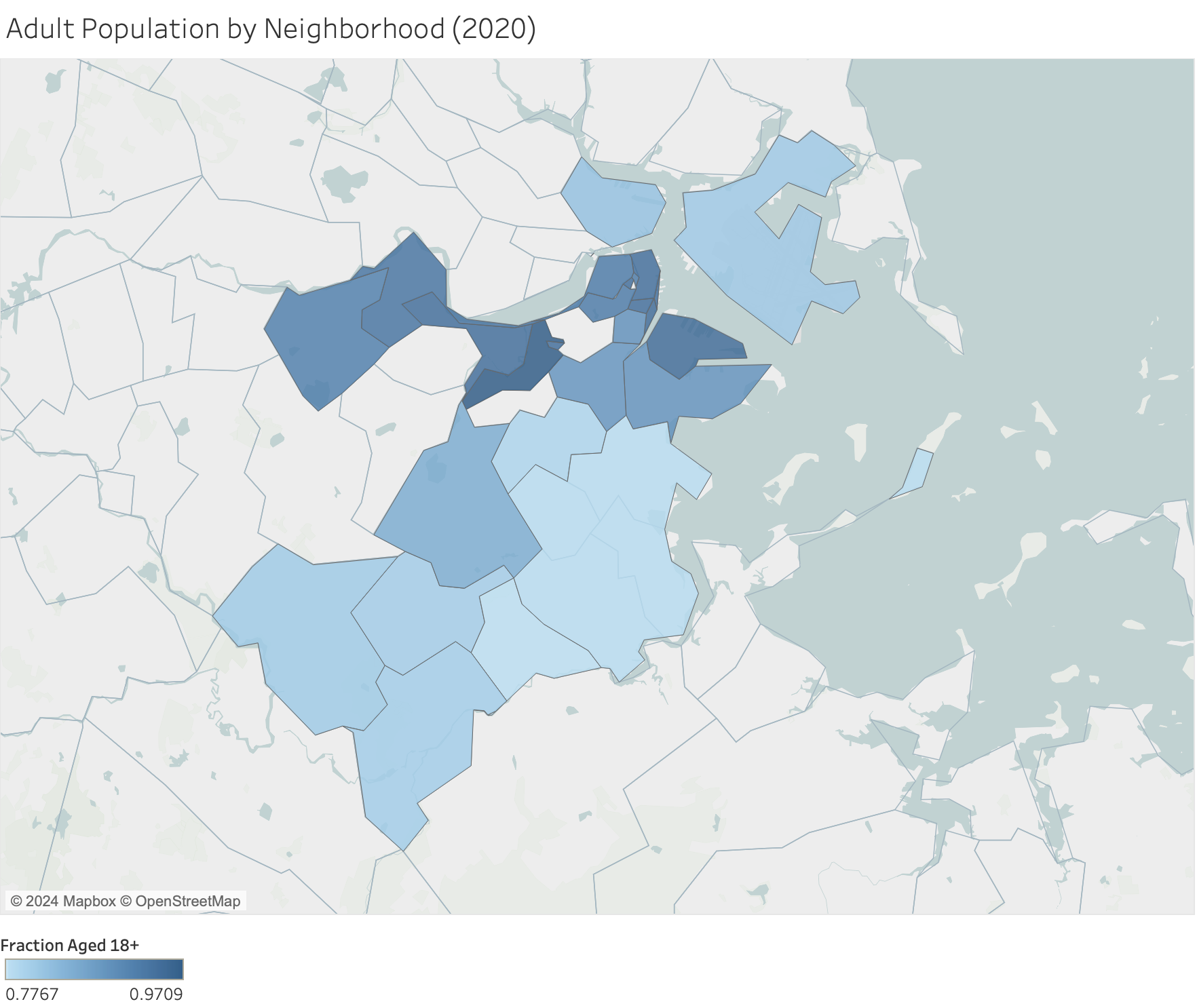
Our next question looks at the relationship between demographics and corporate ownership rates, so we begin by plotting the fraction of the population that is 18+ per neighborhood. We notice that this map looks quite similar to the earlier map of median corporate ownership rates, where there is a higher proportion of adults in the populations of neighborhoods lying along the waterline and closer to downtown. It looks like most families live farther out from the city and farther inland (since the proportion of children in a population could act as a proxy for presence of families). So the similarities to our earlier map raises the next question: is there a negative correlation between child population and corporate ownership rate?
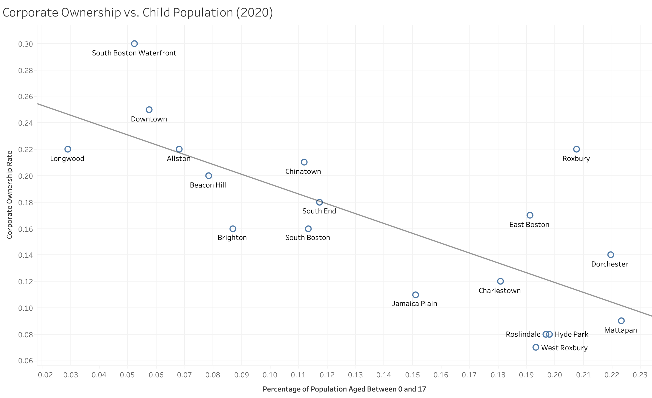
Since the census data is from 2020, we perform a regression on the 2020 corporate ownership rates against the percentage of the population that is aged younger than 18. Though the points are not perfectly fit to the line, we do see an overall negative relationship between percentage of population aged 0-17 and the corporate ownership rate. We don’t see a clear pattern to the neighborhoods with a higher-than-expected corporate ownership rate—South Boston Waterfront, Downtown, Chinatown, Roxbury, East Boston, and Dorchester tend to be on the eastern side of Boston and a bit closer to the water, but there are still other neighborhoods in that area that do not have the same relatively high corporate ownership rates. Since we still do see a relationship between child population and corporate ownership rate, we will next investigate whether there is a relationship between total population size and corporate ownership rate.
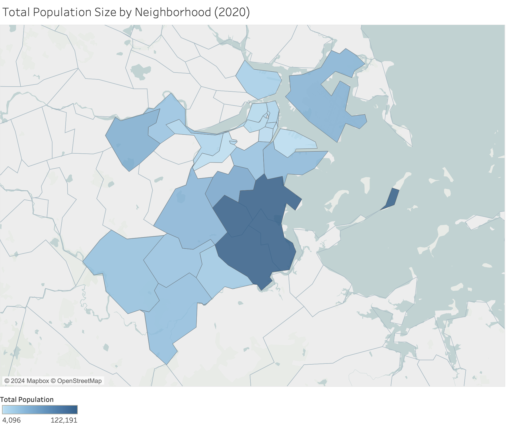
Unlike the regression looking at proportion of adults in a population against corporate ownership rate, we do not see a clear relationship between total population size and corporate ownership rate. However, the incredibly large population size of Dorchester suggests that this might be an unfair comparison because the data is not normalized by neighborhood size. To further consider this, we can next look at the distribution of total population across different neighborhood sizes.
We plot the neighborhoods by total population size, where the darker regions have a larger population. Some of the neighborhoods are much, much larger than others, and these larger neighborhoods unsurprisingly tend to have larger population sizes. We notice that the neighborhoods closer to downtown and the Charles/harbor (which were also those that tended to have higher corporate ownership rates) tend to have a smaller size. Thus, to better understand how the population of a given neighborhood might be related to corporate ownership rate, it would be useful to perhaps combine our dataset with one that contains information about neighborhood area or population density.
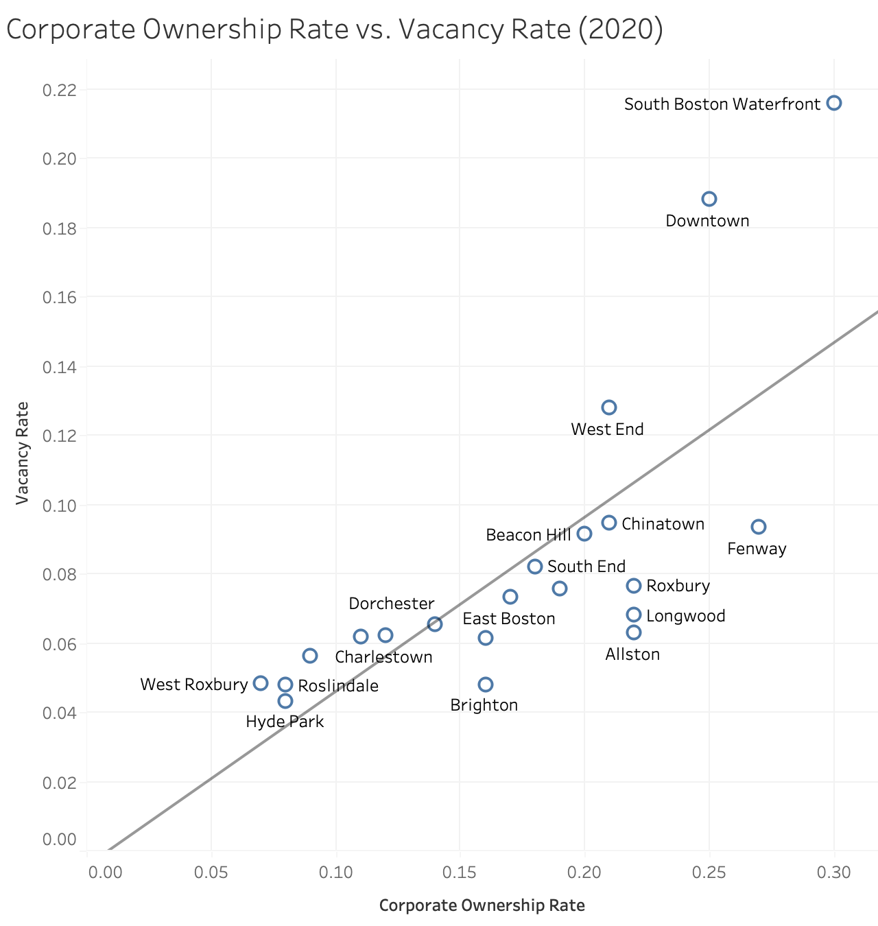
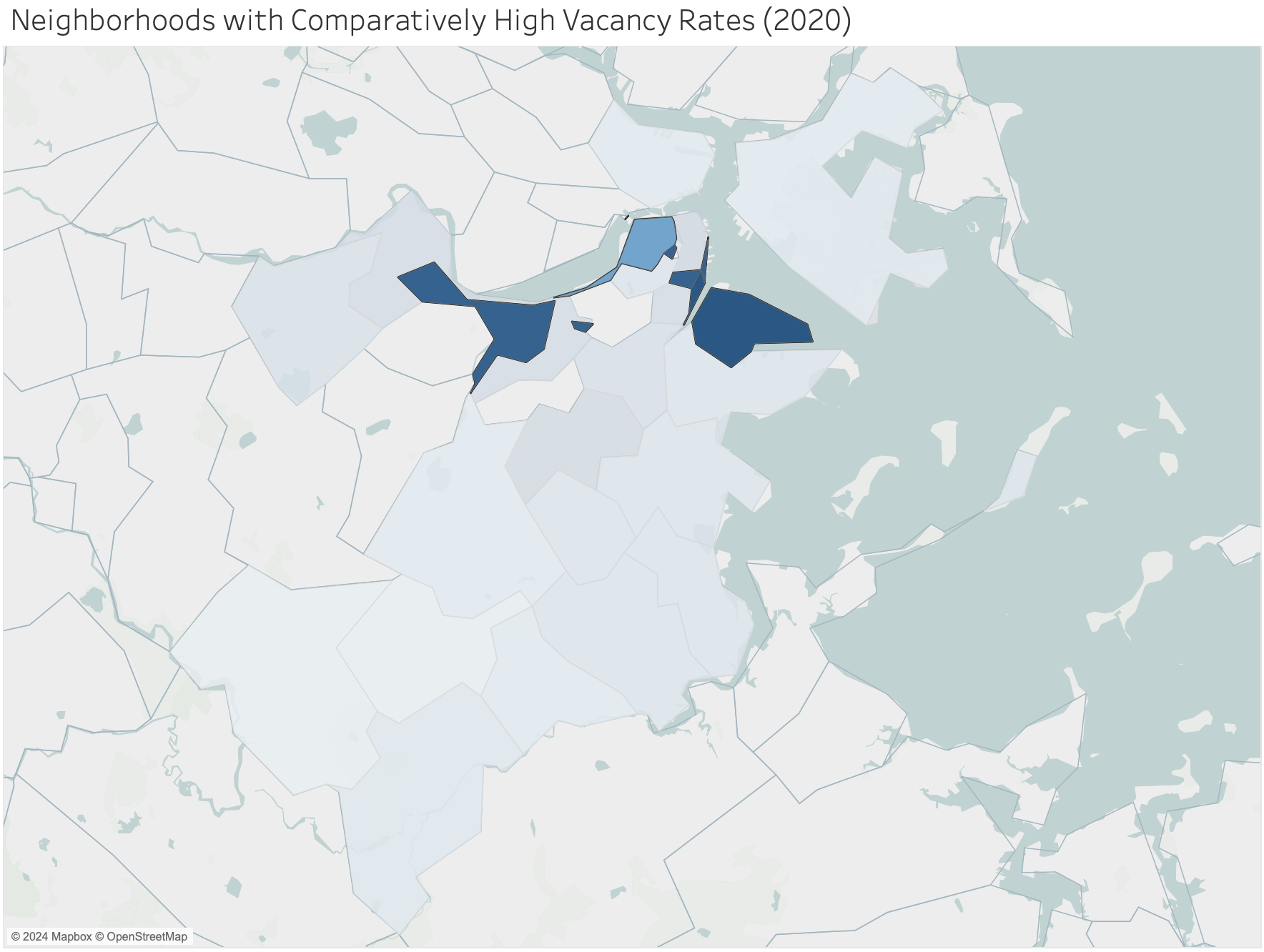
We next look at the question of whether there is a correlation between percent of vacant units and corporate ownership rates in 2020 (since that was the only year the vacancy data was available). We see a very clear relationship between vacancy rates and corporate ownership rates, which provides evidence supporting some of the articles we read that discussed the effects of corporate ownership on vacancies. We do notice a few neighborhoods—South Boston Waterfront, Downtown, and West End—having higher vacancy rates than expected given their corporate ownership rate. So one follow-up line of investigation is to see what these three neighborhoods have in common.
In this map, we highlight the neighborhoods that were shown to have relatively high vacancy rates given their corporate ownership rates (South Boston Waterfront, Downtown, and West End). We see that these neighborhoods tend to be along the Charles and harbor. From our past analyses, we notice that these are areas with comparatively high corporate ownership rates, higher variability in corporate ownership rates over time, and populations that tend to have a higher proportion of adults.
Summary
In this analysis, we first assess the quality of the dataset. We find that the dataset's values are consistent and reasonable, but there are some issues with missing or mislabeled data (the census data is restricted to the year 2020 despite being labeled for other years, and some neighborhoods are missing). When looking at corporate ownership rates over time, we find that there has been a general increase in corporate ownership rates across all neighborhoods, with the most popular neighborhoods experiencing the most variability in corporate ownership rate. The neighborhoods with higher corporate ownership rates tend to be near downtown and along the Charles/harbor, though some neighborhoods in north Boston have recently become relatively more popular with corporate owners. We also find that corporate ownership rates are higher in neighborhoods that have higher vacancy rates and populations with a higher proportion of adults. In future analyses, it would be interesting to combine our dataset with information about population density/neighborhood size, pricing, or census data for multiple years.