Assignment 3 Visualization Design
Megan Le — meganle@mit.edu
Phase One: Sketching Visualizations
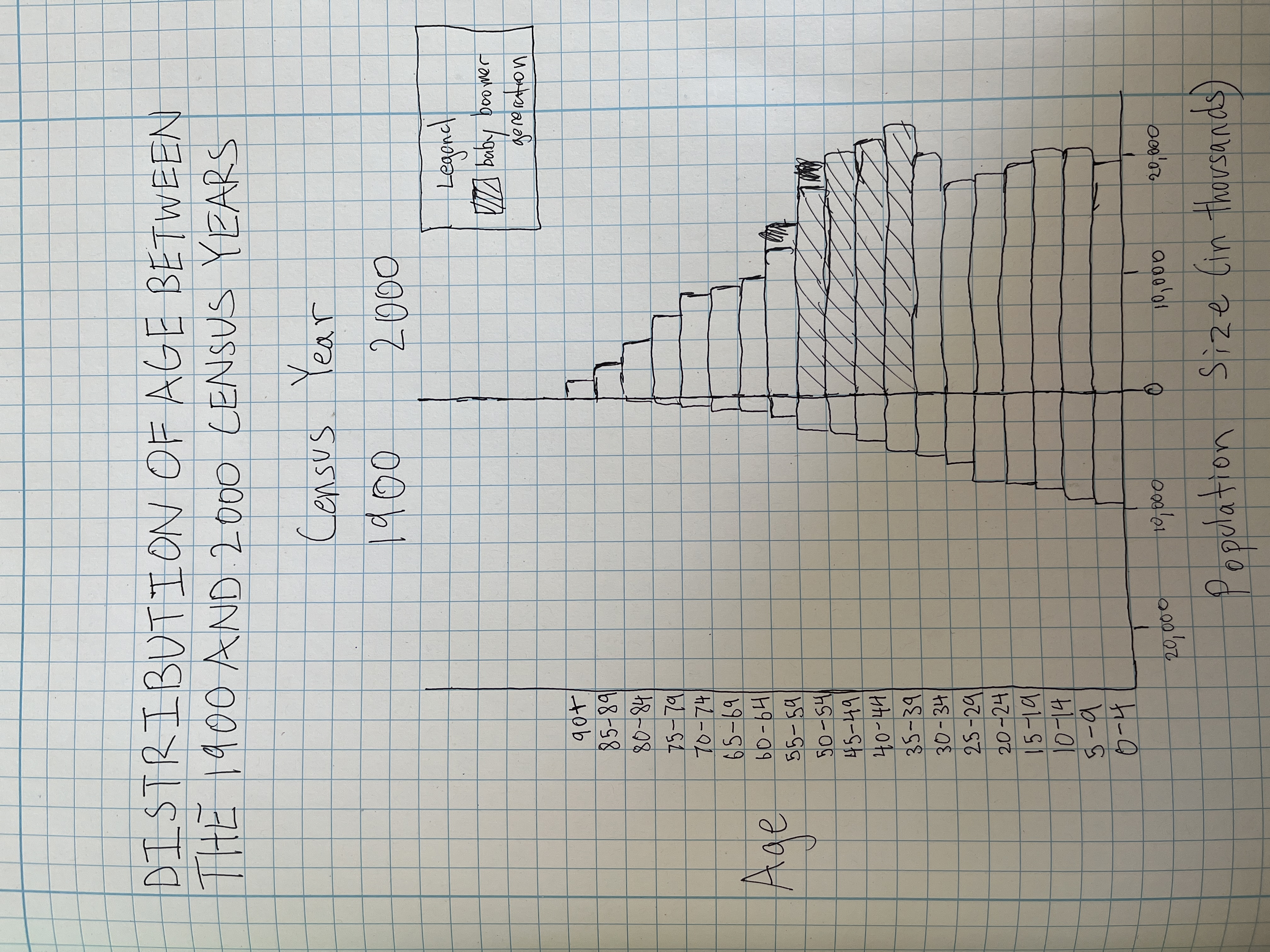
Design Rationale for Sketch 1:
- Population pyramids are very effective at communication population composition by age and sex, so I wanted to experiment with a design that used census year instead of sex.
- My main motivation was to show how the baby boomer generation impacted the shape of the 2000 distribution, and that the populations otherwise had relatively similar distributions (besides magnitude).
- This design is effective in showing the difference in shape population distribution across both years (i.e., we can see that the 1900 population sizes steadily decrease as age increases, while the 2000 population sizes have more fluctuation).
- This design is not as good at comparing the magnitude of difference between years for the same age group, since the bars go in diverging directions and are not next to each other (though we get a sense of the 2000 sizes being larger in general, it's harder to do more fine-grained comparisons).
- The audience might be confused or analyze the figure incorrectly since it looks so similar to a population pyramid but actually shows different information (e.g., they might be looking at whether the pyramid is "balanced", which matters when looking at sex composition of a population but doesn't matter for this data).
- In future sketches, I could try a more direct comparison (e.g., a bar chart of 2000 population sizes, where part of each bar is shaded in to show the 1900 population size).
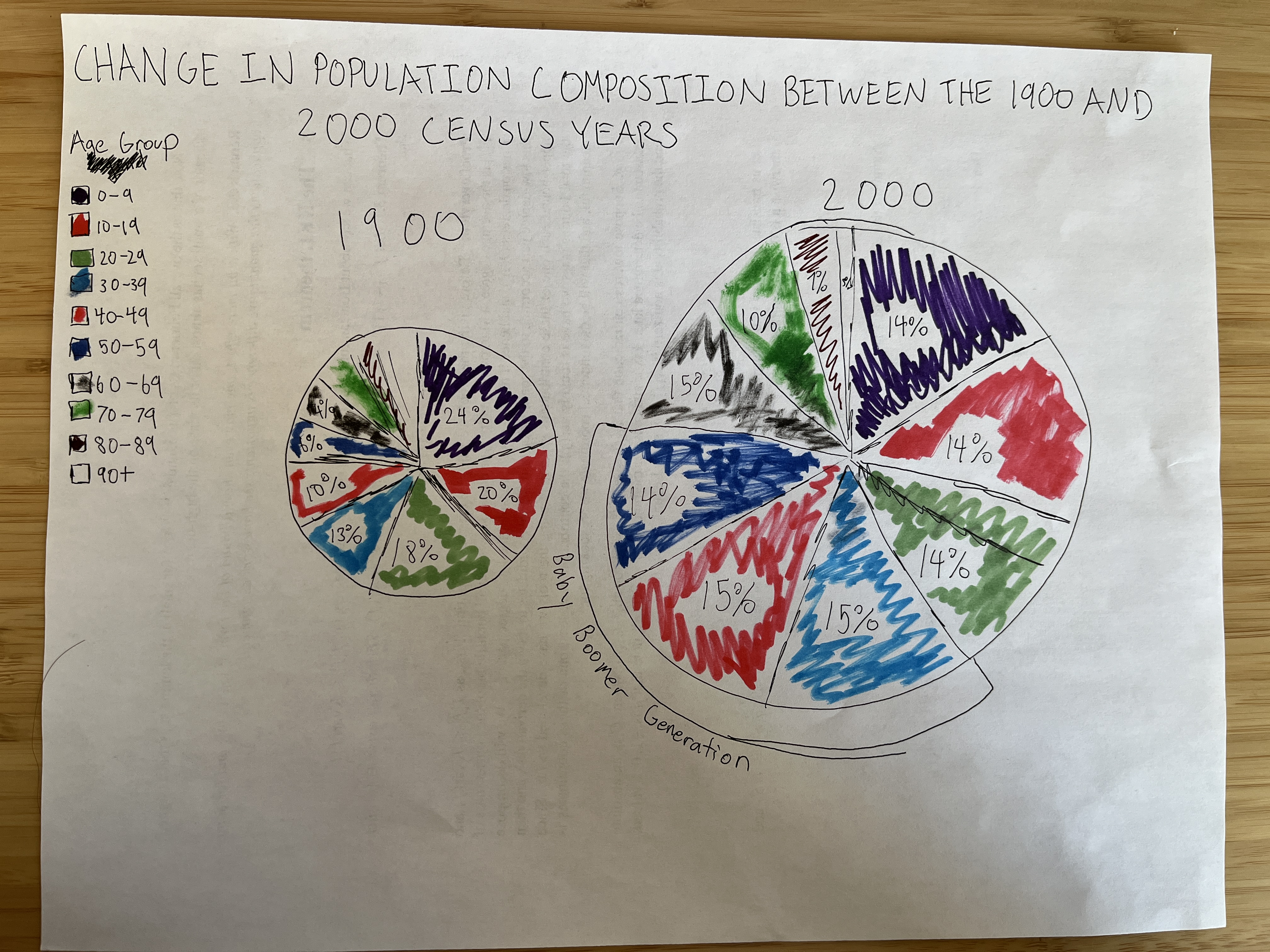
Design Rationale for Sketch 2:
- I wanted to experiment with using percentages rather than total numbers to communicate the change in population distribution, since it's a different approach from my last design that might do a better job of directly showing the change in population composition.
- I wanted to communicate how the distribution in 2000 became more uniform compared to 1900 because of the baby boom, which I annotated.
- To make the chart more legible, I grouped the ages in decades rather than sets of 5 years.
- I think that if the pie charts were scaled correctly with the actual values, it would be effective in showing how the overall composition of each year's population is different. However, I do think it's difficult to get a sense of how individual age groups have changed between years.
- Though I tried to incorporate a sense of the magnitude of the change in population size by scaling the size of the circles, I think the design doesn't emphasize that point well enough.
- In future sketches, I could try to compare the percentages more directly, rather than separating the groups by year, or perhaps think of another data transformation that could characterize the differences in distribution.
- I could also try adding more annotations, like pointing out how the percentages decrease as age increases except for where the baby boom is.
- I could also try using a different color scale (like shades of the same color, rather than different colors) to represent the changes in age groups as an increasing continuum.
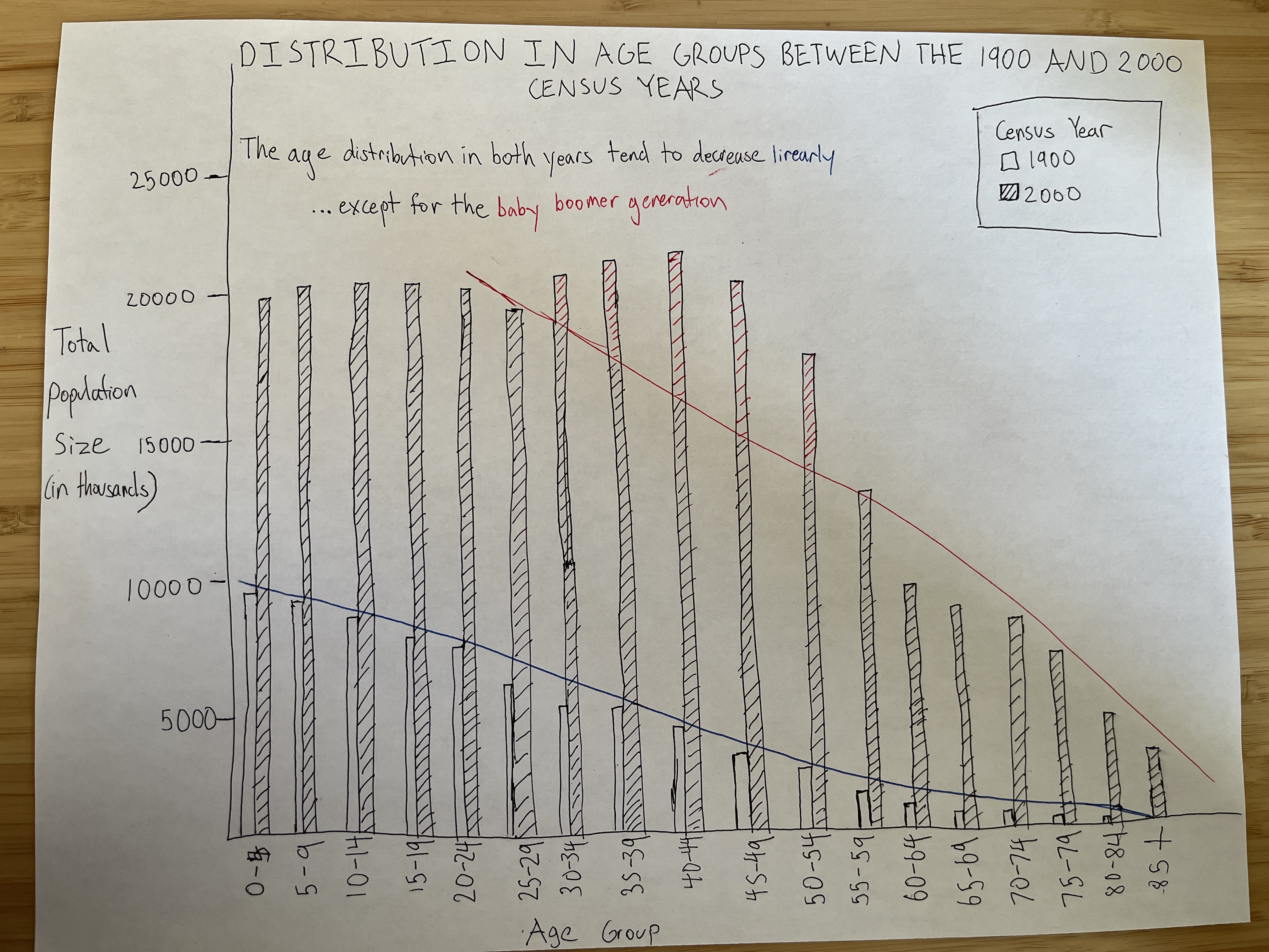
Design Rationale for Sketch 3:
- I tried to incorporate elements that I wanted to improve on from both of my previous sketches (a better direct comparison of the two years, and more descriptive annotations).
- My main motivation was to show how the age distributions follow the same overall trend besides the baby boomer generation.
- I think the trend lines were effective in showing the similarity in distributions (aside from the baby boomer anomaly). I also think the use of color in the annotation text helped draw attention to the corresponding bars in the graph.
- I decided to use texture instead of colors to distinguish between years so that when I highlighted the baby boom, there was more continuity and it didn't look like a stacked bar chart with two different bars. However, I think this may visually conflict a bit with the trend lines, so perhaps I could try a different texture.
- This design did improve on direct comparions of changes between individual categories over years. However, it does feel like the 1900 bars can get swallowed up by the 2000 bars, perhaps making it a bit harder to get a feel for the overall distribution per year.
- In future sketches, I could experiment with other textures and other layouts that are better at balancing both intra- and inter-year comparisons.
Reflection
I think the first two sketches give a good sense of each year's overall distribution but are less effective at inter-year comparisons, while the third sketch is overall effective at highlighting the differences between the two years but has issues with balance between the years and communicating the 1900 data. I think the second sketch is the weakest overall in highlighting the difference in trends between the two years and seeing exactly where the difference occurs, but I do like that it shows the population compositions without the 1900 marks being overwhelmed by the 2000 marks (unlike in the third sketch). The first sketch is perhaps misleading in design due to its similarity to a population pyramid, and it isn't as quick at communicating differences between years, but I liked that layout's effective communication of the intra-year changes across groups. So for the next phase, I'd like to use the third sketch as a position to iterate from, incorporating elements and lessons from the first two sketches to improve the design (i.e., the better visual balance between years in the second sketch and the layout in the first sketch that makes it easy to quickly grasp each year's distribution).
Phase Two: Final Design
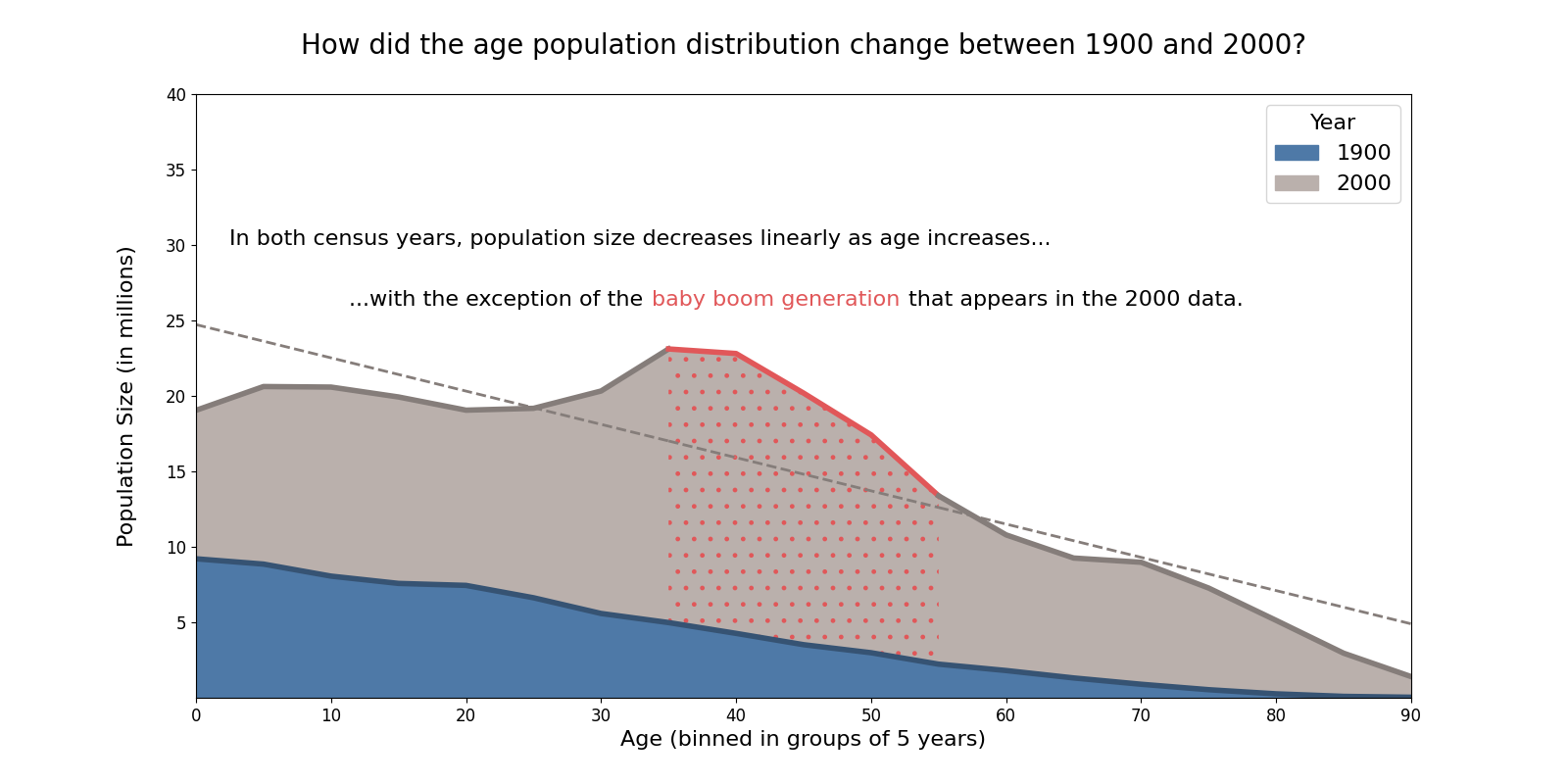
Design Process & Design Decisions
I started iterating from the third sketch of phase one, since I liked the overall layout the most (namely the more direct comparison between the cenus years). I kept the main annotation choices from the third sketch, where some of the text color matches the indicated region on the graph for quick association. Since the third sketch had the issue of the 1900 bars being overwhelmed by the 2000 bars, I tried overlaying the histograms instead. However, this turned out to be visually confusing, since it ended up looking like a stacked bar chart, making it unclear what each bar indicated. So I used a continuous line chart instead, making the outlines darker to emphasize that the distributions are distinct and not stacked. I then added a note in the x-axis title to clarify that the values were in steps of 5 years, not 1 year.
When it came to annotations, I had initially shaded the baby boom generation that fell above the trend line as a separate color. However, this was visually confusing, since it looked completely separate from the 2000 data. To address this, I used a texture instead (choosing dots to not conflict with the line plots and trend lines) and extended the shading to beneath the trend line. This made the baby boom section look much more integrated with the 2000 distribution compared to before. I also removed the trend line for 1900, because once I plotted the actual values from the dataset, the distribution looked so similar to an actual straight line that the trend line ended up being distracting and unnecessary. I also made the trend line dotted instead of solid to help distinguish it from the population distributions, and I kept the line the same color as the 2000 distribution so that it would be visually associated with the 2000 data. After reflecting on the second sketch from phase one, which used a wide variety of bright colors, I also wanted to be more deliberate with my choice of color. So I settled on this final combination because the grey and blue were distinct yet muted enough so that the baby boom annotation stood out, and the colors did not clash.
One thing that I also played around with was using a color gradient to communicate the change in population composition percentage-wise (i.e., coloring the age group population by their percentage of the total population), which was something I liked from the second sketch of phase one. However, I thought it ended up being a bit overwhelming (and perhaps a bit redundant since this layout provides an easy way of comparing overall distributions anyway). Something else that this visualization doesn't focus on is the change in population size between years. I considered adding another annotation about the magnitude of difference, but then decided that it would be better to focus on communicating the baby boom takeway to keep the visualization concise and not overwhelming. I made this decision because it's possible that some viewers wouldn't immediately make the connection to how old baby boomers were in 2000, but viewers would still notice the difference in population size just by seeing the graphs. Another iteration of this visualization, however, could look at and perform transformations on the population difference numbers to identify more interesting insights for that aspect of the data.
Reflection
I found the conscious intentionality of phase one to be really useful—I was used to opening data in Tableau and sort of just poking around to find the most clear way of displaying the data. This phase helped because it made it easier to experiment with things like texture or creative layout (and I eventually used a different tool from Tableau to make my final visualization, because some of the aspects I played around with were not able to be easily manipulated through Tableau). There were moments where I would be halfway through sketching something, then realize why it was a bad choice, but the complete freedom made it easy to figure out what solutions would work to improve the design. A lot of the elements from different sketches reappeared in the final design (like some of the annotation and layout choices), because the iteration helped me get a sense of what worked well with what. I was able to figure out which layout worked the best among all the iterations (elements of sketches 1 and 3), and evaluate how well certain textures and annotations worked in different contexts (again, sketches 1 and 3). Sketch 2 was just as important to the process, even though I didn't use much from it, since it helped me realize that the layout and colors didn't work well. However, as useful as phase one was, I do think there's value in making some sort of exploratory data analysis early in the process to help get a sense of what I want to communicate. When I was sketching the first design, I had no idea what kind of trends would appear, which made it harder to know where I wanted to go with the design.