Assignment 4 Persuasive or Deceptive Visualization?
Megan Le — meganle@mit.edu
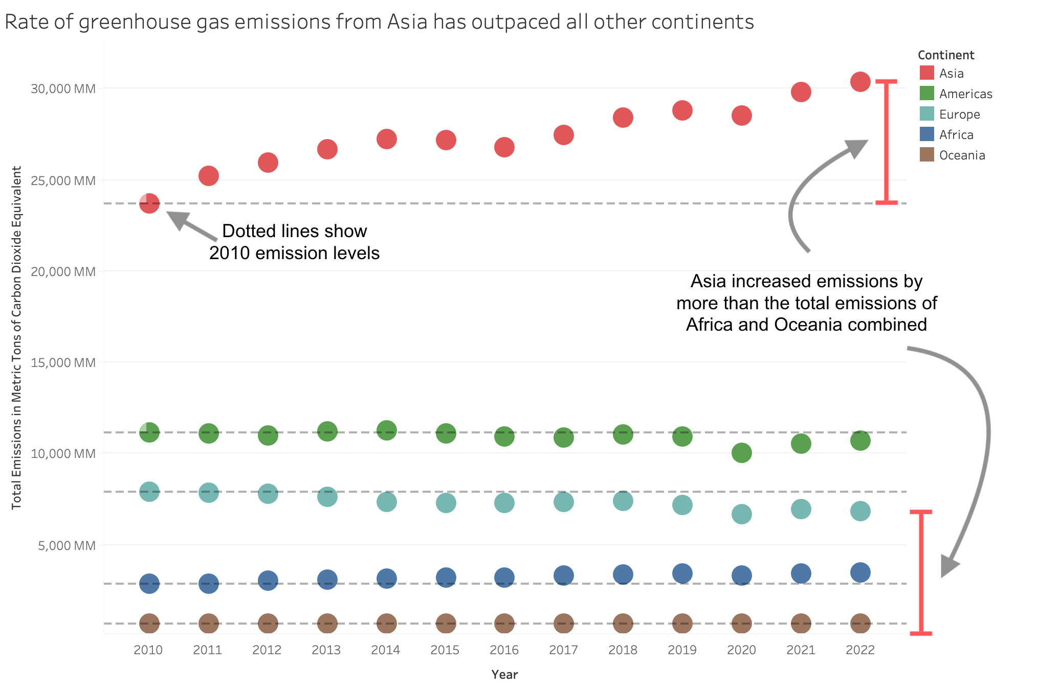
Proposition: Global greenhouse gas emissions have been increasing worldwide largely due to significant increases in emissions from Asia.
FOR the Proposition
Design Decisions and Rationale:
- Score: -0.5, since I made many decisions that emphasized certain aspects of the data with some visual distortions, but I don't think I distorted or transformed the data itself in misleading ways.
- When exploring the dataset and choosing which values to display, I could've chosen to plot levels from different industries or household emission levels. However, I used total emissions for two reasons. Firstly, the difference between Asia and the other continents was much larger when using total emissions. Secondly, using total emissions made the number largers, which would support the intention of the figure to show that emission rates are large and growing.
- I used reference lines to indicate the initial 2010 emission levels, which helped emphasize the difference in emission levels over the last decade. This could be misleading in a way that supports the figure's message, because the points for the non-Asia continents are close enough that the lines might appear to be flat trend lines, even though some continents like Africa are actually increasing. For Asia, the points are distinct enough that it does not look like a flat trend line.
- I annotated the difference in emission levels for Asia between 2010 and 2022, then used this to make a direct comparison to the total emission levels of some of the other continents. Though it might have been more appropriate to do a comparison to other continents' changes as well, rather than their total levels, this provided a very fast and succinct comparison that emphasized the figure's message.
- The units from the dataset were originally in thousands of millions of metric tons, but I changed it to just be metric tons. As a result, the numbers on the axis looked larger and made the changes in emissions seem more significant compared to before.
- I made some color/size decisions to emphasize the figure's point. Firstly, I used circle marks and increased their size, while it had previously been represented as bars. For Asia, this did not affect perception of the data by too much, since there is a very clear rise in emission levels. However, for the other continents, it made their differences in levels seem much smaller (e.g., it's less clear that levels in Africa are also increasing). Even if the non-Asia continents rise above the 2010 reference line in later years, it still looks like those values are touching/on the reference line due to the size of the circles. Second, I chose muted and cool colors for most continents but then chose red for Asia due to the association of red with alarm/danger.
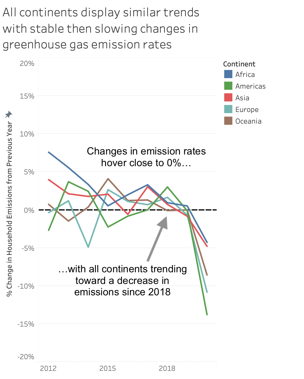
AGAINST the Proposition
Design Decisions and Rationale:
- Score: -1.5, since I cherry-picked data and chose transformations and layouts with the intention of obscuring the nuances of the data.
- I plotted the change in emission levels by year, which can be very misleading. This means the curve of the line plots are actually showing the second derivative of the emission levels, not the first derivative, which can be harder for viewers to intuitively grasp. For instance, I say in the caption, annotations, and title that the rate of change remains stable, but that's actually not a good thing—because of compounding, the emissions would grow exponentially, even though my text makes the stability seem like a good thing. Plotting the percentages like this also obscures the fact that some continents do have much higher raw values.
- When choosing which values to plot, I chose to use household emissions instead of total emissions because the differences between continents was smaller, and the rates of change were lower. I then labeled the title with "greenhouse gas emissions" and only specified that the chart plotted household emissions in the axis label. This is technically not lying, but is still intentionally misleading.
- I cherry-picked the data by removing the data for 2011, as well as the data for the years after 2020. This is because the value for Asia was much higher than the other continents in 2011, so it didn't fit the figure's narrative. The years after 2020 showed a natural leap in emission levels due to the world coming out of the pandemic, so I removed those values as well.
- I adjusted the axes in a few ways to make the plot look more flattering for the figure's narrative. Since many people would likely make the connection between the 2020 pandemic and the drop in emission levels as an anomaly, I removed the labels for many years so that 2020 wouldn't be labeled. I then compressed the figure horizontally to make it seem like the labels had been removed due to spacing issues, when in reality it was because I wanted to throw attention away from the fact that the sharp decrease occurred in 2020. The arrow in the annotation helps with this effect as well by drawing attention to the 2018 point, so that even though viewers get the sense there's a large drop afteward, they don't look to the 2020 point as closely first. I also zoomed the plot out as much as I felt would appear reasonable and centered the y-axis on 0. This made the values and fluctuations look smaller and more trivial, and the centering at 0 made the whole graph seem "lower" overall because of the 2020 anomaly dragging down the minimum y-axis value.
Final Reflection
I found this process very surprising, because I started out a bit skeptical about how easy it would be to distort things. However, the further into the process I got, the more I realized how seemingly small decisions can really affect the way the figure is received, and how blurry the line between acceptable and deceptive can be. I first made the "for" figure, and thought the visualization would be entirely earnest because I did think the raw data supported that stance more than the "against" stance. However, I remember getting to the stage where I had to choose the mark shape and size, and I realized how much that affected the perception of the non-Asia continents. When I deliberately enlarged the marks, I stopped and asked myself, "Is this emphasizing my point, or is this just distorting the data?" Once I was aware of how much that decision could affect the figure, I was much more conscious of the little things I could do in the "against" presentation to distort the data.
I think when drawing bounds between deception and persuasion, you need to question your intent to determine whether you're trying to make the nuances of the data more clear, or if you're trying to obscure data. For instance, when I was adding the bar annotation in the "for" figure, I believe that was acceptable because it was highlighting a simple trend in the data. But when I made a lot of the decisions for the "against" figure, my line of reasoning was not, "How can I most clearly convey this message?", but rather, "How can I make the context of this data less apparent to an unsuspecting viewer?" For instance, the reason I decided to plot percent change is that I wanted to obscure the fact that Asia's emissions were so much larger than the other continents, not because I thought rate of change would be a good metric for this topic. Another example is how I cherry-picked the data in the "against" figure, which I think would be unacceptable. I think an earnest visualization could've remained persuasive by including the points and using annotations or the caption to put the points in context and highlight the other interesting trends. The question of me enlarging the marks in the "for" figure is a little more complicated, but I do think that it falls under deception because my intent was to hide the rising emission levels for some of the non-Asia continents. In the end, I think a lot of this comes down to whether you believe your data actually supports the claim you're pushing.